Ovo Atelier Relacional
Branding/typography/illustration
Ovo Atelier Relational is designed to be a Creative Ecosystem! An alchemical space for interaction and practical and theoretical research in Art, Education and Mental Health.
The word OVO is a palindrome, which backwards and forwards have the same meaning. The word "OVO" in Portuguese means "eggs" and brings a reference to the human cycle, the development of ideas and creativity. The name is inspired by the rich and playful symbology it carries.
The brand has existed for 10 years in the market and had never invested in branding, so there was a process of a lot of collective visual experimentation until the identity process was finalized.
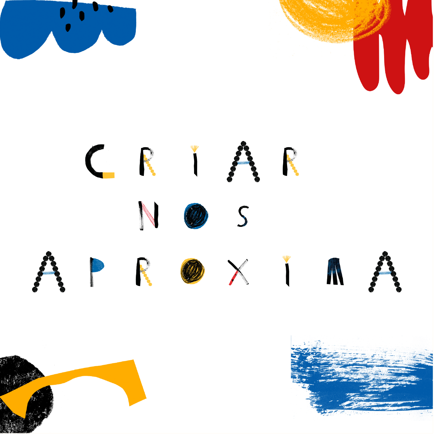
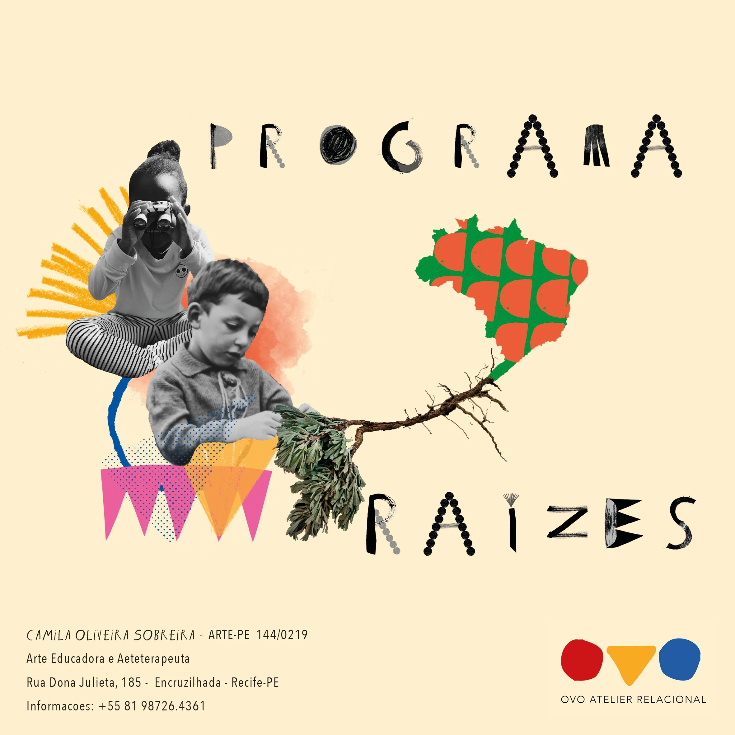
For this project, an experimental typography was created, which was included as the main typography of the brand, and is part of the set of graphic pieces used by the company. This typography, as well as the main prints, were created through an experimental creation process - imitating the art therapy processes proposed as some of the activities carried out in the company's day-to-day. Resulting in unique prints and a super powerful, expressive and striking identity.


